
Today was the day to print the red layer on the Youngfolk & The Kettle Black coffee bags. It started off looking like this:
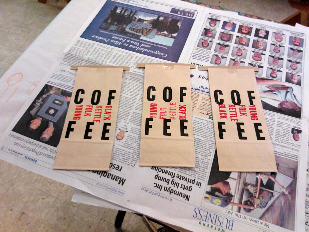
I struggled with various ways of squeezing “Young Folk Kettle Black” into the restricted space and position the coffee bag offered me (there are two vertical creases that need to be avoided). But no matter the orientation, I wasn’t happy with the result. I stared at each option. Walked away. Came back. Stared some more. And nothing made me happy.
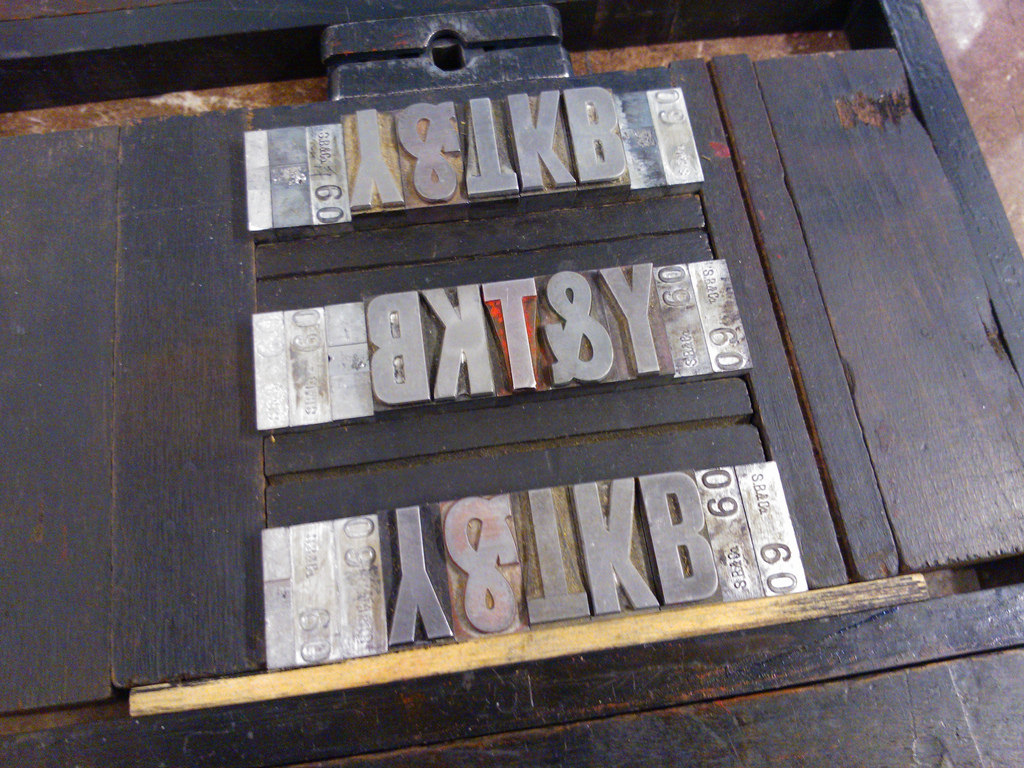
So I took the chase off the press, took it upstairs, sorted the type back into its drawer, and started again, ending up with this:
Which, when printed, looked like this:
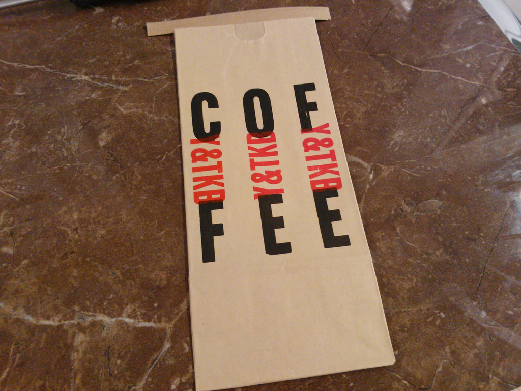
Which did make me happy. So I printed 160 bags:
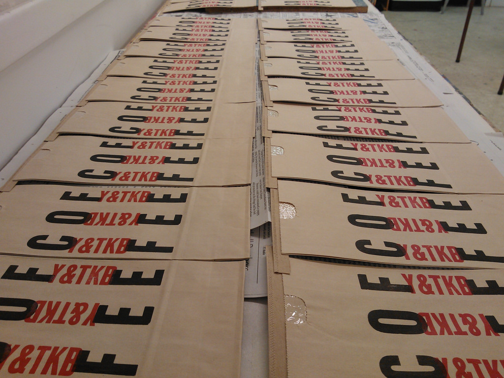
I’m quite pleased with the result, given the contstraints. The final test will be seeing the bags filled with coffee and on the shelves of the Youngfolk roasting operation up the street on Victoria Row.
Sometimes the only solution to a design problem is to break up with your original visions and come up with something entirely new.

Comments
Hi Peter, I picked myself up a bag of ground beans today for my french press, the bags look great!
They look great — the simplified, acronym matches the very modern company name. A winning design.