
It seems that my recent acquisition, 30 pounds of Bodoni 12 point, is a little less “sorted” than I would like it to be.
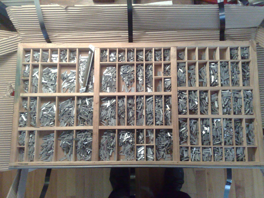
The type arrived in California Job Case, which is essentially a drawer with dividers that make compartments for each letter:
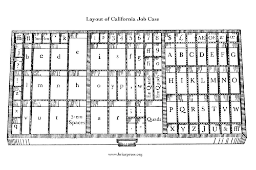
The placement of each letter is standardized by tradition; here’s the California layout (from briarpress.org):
As soon as I started to set my first paragraph with this type I started running into problem: I was pulling more non-letter-d’s out of the d’s than I was actual letter d’s; I had l’s in my t’s and b’s in my q’s.
A collection of completely unsorted type – like this – is called pied type. What I’ve got is certainly much, much better than that. In my case it seems that the mis-sorting is a combination of simple laziness on the part of previous printers combined, perhaps, with a desire to fill up every letter’s compartment with something to increase the perceived resale value of the type (I’m confident this didn’t happen at Don Black Linecasting, where I bought the type, but rather at an earlier stage of its life).
So I have two choices: put up with it and handle the mis-sorting as I go along – death by a thousand cuts, perhaps – or buckle down and sort everything out in advance.
I’ve opted for the second, and am now making my way slowly through each letter.
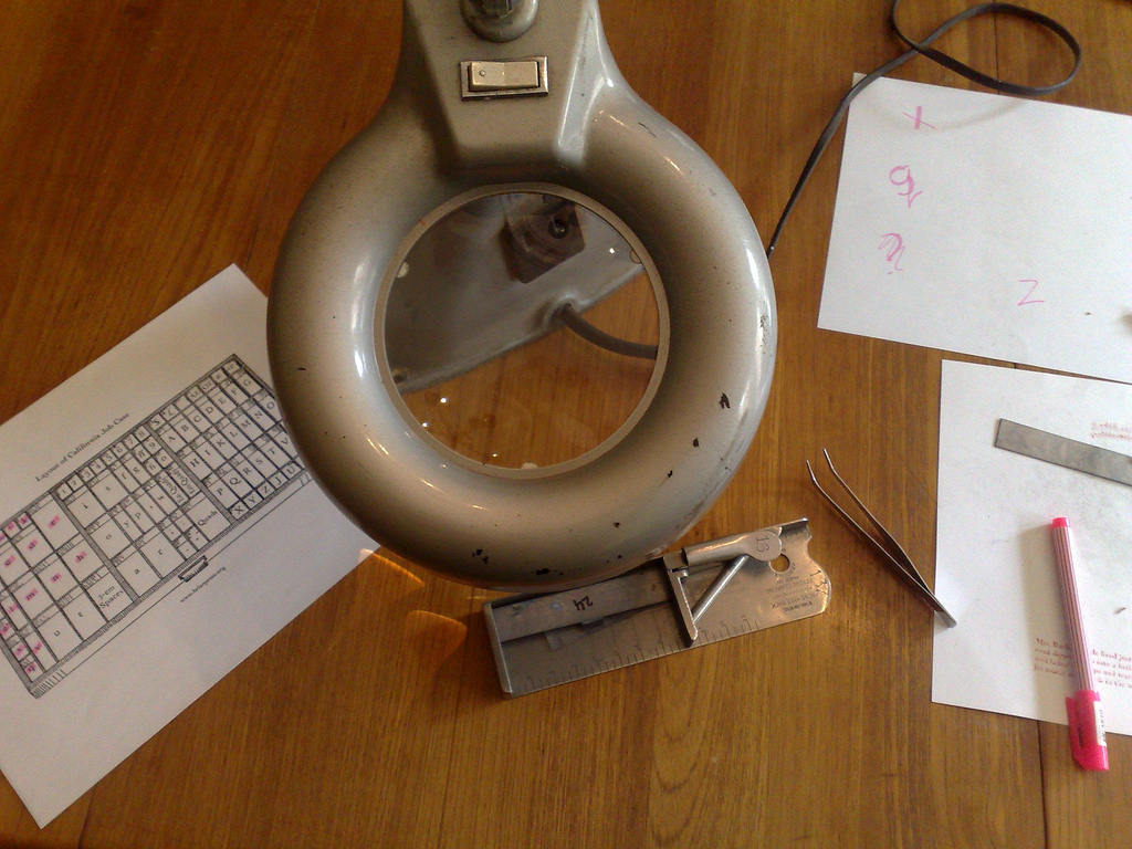
I pull all the type for a single letter out of the case, sort it into a composing stick, and then use a lighted magnifying glass (thanks to Catherine the jeweler for the lend of this!) to pull out every mis-sorted letter with a pair of tweezers (also from Catherine – it helps to have a silversmith in the family).
If you look at the job case layout above, I’ve made my way from the top-left corner – ffi – across through fi, ‘, k, j, ? b, c and d to e, and and then down through !, z, l, m, n, h, x, q, and v.
It’s tedious (though oddly relaxing) work, but it does have the surprising upside of making me very intimate with Bodoni letter-shapes and with the Calfornia job case layout (and given me cause to wonder whose idea it was to locate the ! and l characters and the z and x characters right beside each other – even under a magnifying glass x and z look almost exactly alike).
When I’m done – it will likely take me another week or so, working an hour or two a day – I’ll have a completely sorted case of job, and from then on I’ll have only myself to blame for mis-sorted type.
This type-sorting process is very evocative of the process I used to go through with my TRS-80 Model One computer and program listings from Creative Computing magazine. The magazine used to publish programs that enterprising geeks like myself could type in, line by line, to our computers to run locally (this was pre-Internet and, indeed, pre-cheap-transfer medium of any kind).
It would take hours and hours to type in a decent sized program. And then some more time to correct all the typing errors that prevents the program from actually running. Like sorting type it was tedious work, but the result was an intimacy with code that I’ve not experienced since; I get the same feeling from sorting type: there’s a knowledge of metal type that can only be gotten by examining each and every letter of a font under a microscope.

Comments
So in the past your writing style has reminded me of Garrison Keillor but today you’re chanelling Bill Richardson’s Bachelor Brothers B&B. Savouring the simple.
Here’s my progress after 4 days:
<img width=”500” height=”378” alt=”Job Case Progress” src=”http://farm5.static.flickr.com/4139/4904056713_2246f8e634.jpg”/>
Also, 2 of the longlisted titles for this years Man Booker prize feature the printing profession: Parrot & Olivier in America by Peter Carey and The Long Song by Andrea Levy.